
Weekly briefs, live protocol stats, product proposals, GTM strategies, and the ideas roadmap — one home for the team.

Design reference

User flows — the full journey, four ways

Every major screen in the user journey, four ways. The TODAY panels are real captures: production bags.fm screenshots (1440px viewport) and mobile screens from the current App Store build — where no public mobile capture exists, a hand replica of the shipped screen fills in and is labelled as such. Today, web and mobile are visibly different products — different greens, different grounds, different radii, different type. The kit rows below each step are the simplest possible expression of that screen on the Bags UI v2.1 kit: only the essential components, generous whitespace, with the web and mobile minis rendered from the same button, card, chip, and row skins — so the two form factors finally read as one product.

1 · Sign in

web: a centered card with one 'Verify with X' row · mobile: a hero screen with one green pill · kit: one auth body, two frames
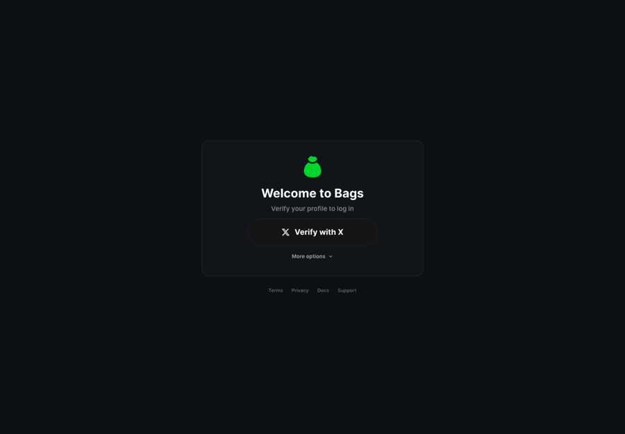
Today — two different products
bags.fm/login
bags.fm login page: centered dark card with green Bags logo, 'Welcome to Bags', a single white 'Verify with X' pill and a 'More options' link
production capture · bags.fm/logincentered #141414 card, single Verify-with-X pill
9:41
Bags

Launch, Trade, Earn, and Discover the Next Big Thing.

Get Started
reconstructed from src/app/auth/login.tsx — no public capture
Kit v2.1 — one system

Welcome to Bags

𝕏G
Get started
kit web target · tokens + ui/* — the same auth body as mobile, in a modal
9:41

Welcome to Bags

𝕏G
Get started
kit mobile · bags-ui-kit/mobile-dark/auth-main.html
centered card page vs hero screen"Verify with X" + More options vs one "Get Started"card #141414 vs ground #1E1F22white provider pill vs flat green CTAgreen #00FF00 vs #02FF40one auth body, two framesone glow CTAone ground #131413

2 · Home / Portfolio

web opens on a launch funnel, mobile opens on a wallet — the kit opens on one portfolio
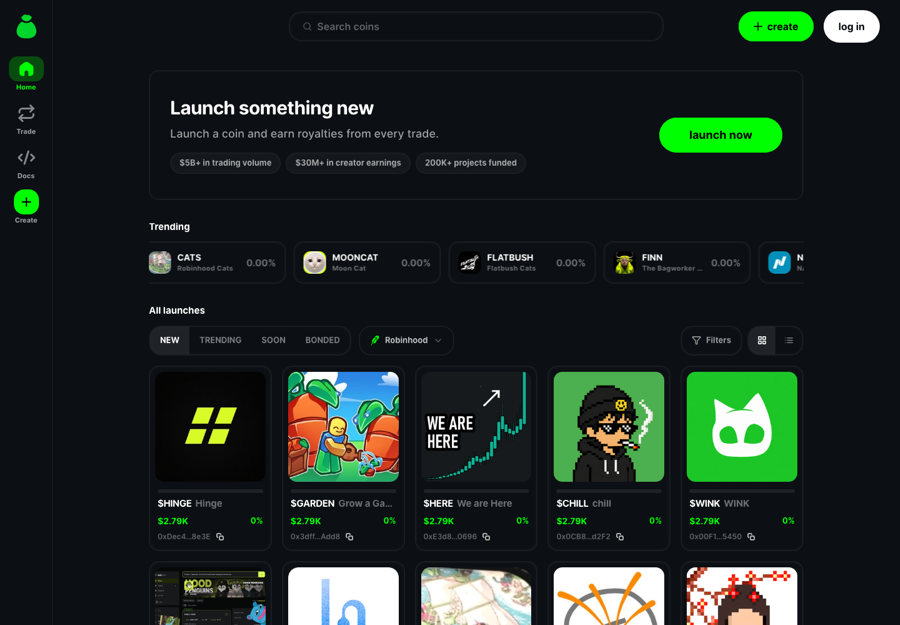
Today — two different products
bags.fm
bags.fm home: green sidebar rail, search bar, 'Launch something new' hero with green launch-now pill, Trending row and All launches grid
production capture · bags.fmlaunch hero + Trending row + All launches grid
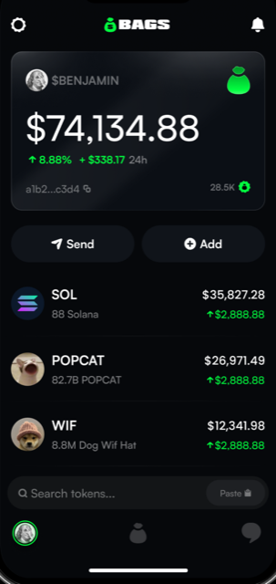
bagsapp home: $BENJAMIN balance hero showing $74,134.88, Send and Add pills, SOL / POPCAT / WIF holdings rows
App Store listing capture · current build — $BENJAMIN wallet hero + holdings
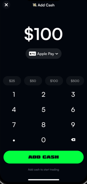
bagsapp Add Cash sheet: $100 amount, Apple Pay selector, preset chips, keypad and green ADD CASH slab
App Store listing capture · current build — deposit sheet
Kit v2.1 — one system
$FINN
$382,491.63
+$852.67
🐱
Beast
$2.4K
+$360.29
🅽
NPM
$1.1K
-$49.92
Deposit
kit web target · same sheen hero + holding rows + one glow button as mobile
9:41
$FINN
$382,491.63
+$852.67
🐱
Beast
$2.4K
+$360.29
🅽
NPM
$1.1K
-$49.92
Deposit
kit mobile · bags-ui-kit/mobile-dark/home.html
green #00FF00 vs #02FF40ground #0c1014 vs #1E1F22launch hero vs $BENJAMIN wallet herolowercase create/log-in pills vs BAGS wordmark chromegrid launch cards vs holdings rowsone green #0BD52Done sheen hero cardone holding row, two frames

3 · Discover / Search

web ships a NEW/SOON/BONDED terminal list; mobile ships TWO feeds — For You trade cards and a Trending list — the kit ships one chip row and one row anatomy
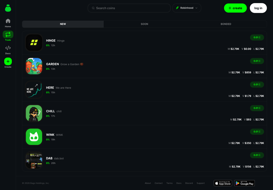
Today — two different products
bags.fm/trade
bags.fm trade terminal: NEW / SOON / BONDED tabs, Robinhood dropdown, token rows with M/V/L stats and green quick-buy chips
production capture · bags.fm/tradeNEW/SOON/BONDED terminal list + 0.01◎ quick-buy chips
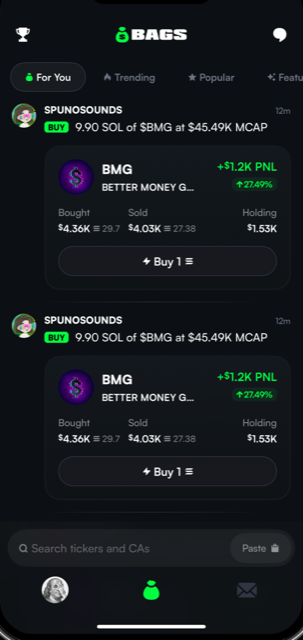
bagsapp feed: For You / Trending / Popular tabs, trade cards with BUY badge and +$1.2K PNL, Buy 1 buttons, bottom search bar and tab bar
App Store listing capture · current build — For You trade feed + Buy 1 slabs
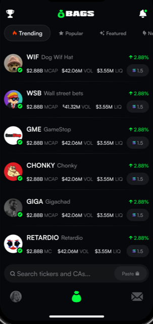
bagsapp trending list: Trending / Popular / Featured tabs, token rows for WIF, WSB, GME with MCAP/VOL/LIQ stats and quick-buy pills, bottom search
App Store listing capture · current build — Trending list + MCAP/VOL/LIQ rows
Kit v2.1 — one system
Search
🔥 Trending💧 New😊 Activity
Beast
🐱🟣🤠16.2k holders
2,428%
NPM
🐱🟣🤠16.2k holders
912%
NYAN
🐱🟣🤠16.2k holders
311%
kit web target · same search pill + chip row + token rows as mobile
9:41
Search
🔥 Trending💧 New😊 Activity
Beast
🐱🟣🤠16.2k holders
2,428%
NPM
🐱🟣🤠16.2k holders
912%
kit mobile · bags-ui-kit/mobile-dark/explore-trending.html
NEW/SOON/BONDED text tabs vs For You/Trending pills2 mobile feeds: PNL trade cards + MCAP/VOL/LIQ listquick-buy: 0.01◎ chip vs "Buy 1 ≡" slab vs "≡ 1.5" pillRobinhood dropdown vs bottom search barone chip row, both surfacesone token row anatomyone quick-buy skin

4 · Token / Trade

web: TV chart + You pay/You receive swap card · mobile: candles + a green BUY / pink SELL footer — the kit keeps one header, one chart, one pair
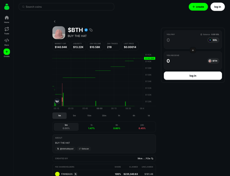
Today — two different products
bags.fm/[token]
bags.fm token page for $BTH: stats row, TradingView chart with timeframe pills, percent-change row, about section and a You pay / You receive swap widget with a white log-in pill
production capture · bags.fm/[token]$BTH · TV chart + You pay/You receive swap widget
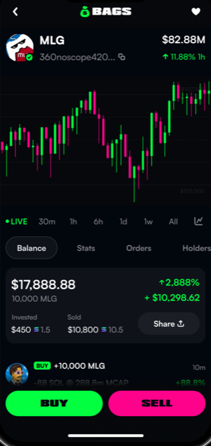
bagsapp token detail for MLG: candlestick chart, LIVE and timeframe pills, Balance/Stats/Orders/Holders tabs, position stats and a green BUY / pink SELL button pair
App Store listing capture · current build — MLG candles · green BUY / pink #FF028B SELL
Kit v2.1 — one system
Zumi
$ZUMI
$0.000241
↑ 12.4%
Buy
Sell
kit web target · same header + candle palette + glow Buy / red-tint Sell as mobile
9:41
Zumi
$ZUMI
$0.000241
↑ 12.4%
Buy
Sell
kit mobile · bags-ui-kit/mobile-dark/project.html
TV line/volume chart vs candlestimeframe pills 1m…1d vs LIVE/30m…Allsell: grey swap tab vs pink #FF028B slabYou pay/You receive card vs BUY/SELL footergreen #00FF00 vs #02FF40one green #0BD52D everywhereone candle palette green/negativeone glow Buy / red-tint Sell pair

5 · Launch / Create

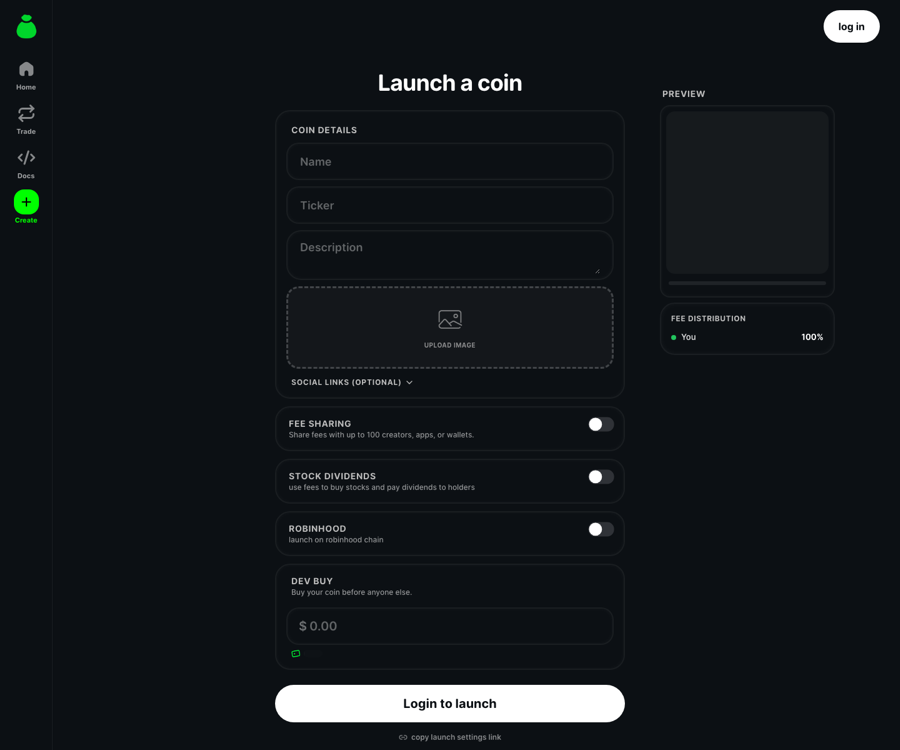
a web form with a white 'Login to launch' CTA vs a mobile wizard where only the ticker goes Padaloma — the kit keeps one field recipe and one glow
Today — two different products
bags.fm/launch
bags.fm launch page: Launch a coin form with Name, Ticker, Description fields, upload-image dropzone, fee sharing / stock dividends / Robinhood toggles, dev buy and a white Login to launch pill
production capture · bags.fm/launchcoin-details form + toggles + white Login-to-launch pill
9:41
Launch on Bags
Create a coin, raise money, and share with friends.
Coin details
Name
$ZUMI
Upload image
Fee sharing
@kazumi10.00%
1%10%50%Custom
Create coin
reconstructed from TokenLaunch/LaunchPage.tsx — no public capture
Kit v2.1 — one system
Launch a coin
Name
Ticker
Upload image
Launch coin
kit web target · same Field recipe + glow CTA as mobile
9:41
Launch a coin
Name
Ticker
Upload image
Launch coin
kit mobile · bags-ui-kit/mobile-dark/create-summary.html
white "Login to launch" vs green r14 slabPadaloma ticker vs OpenRunde everythinginput r20 border-2 vs r14 white/5toggle rows vs preset chips + sliderone Field recipeone glow CTAone form, two frames

6 · Profile / Settings

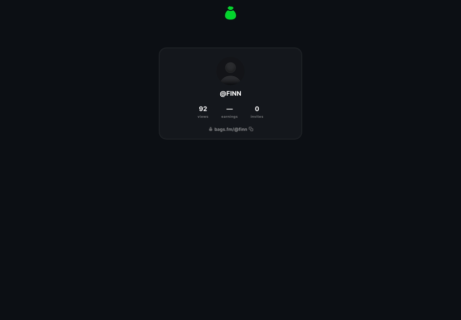
web ships a bare stat-card profile; mobile ships a full settings page with bordered pills and a Padaloma stroke header — the kit uses one row anatomy
Today — two different products
bags.fm/finn
bags.fm profile page for @FINN: a single centered card with avatar, views / earnings / invites stat triplet and a bags.fm/@finn link
production capture · bags.fm/finnbare profile card, views/earnings/invites triplet
9:41
Settings
Quick Buy Amount0.50 SOL
Slippage
3%5%Custom
Auto
MEV Protection
Auto-approve swaps
reconstructed from Settings/SwapSettings.tsx — no public capture
Kit v2.1 — one system
$DARYLGINN
Copy
CurrencyUSD
Swaps
Two-Factor Auth
kit web target · same identity header + settings rows as mobile
9:41
$DARYLGINN
Copy
CurrencyUSD
Swaps
Two-Factor Auth
kit mobile · bags-ui-kit/mobile-dark/settings.html
bare stat-card profile vs full settings pagecard on #0c1014 vs Padaloma stroke headerno web settings vs h42.5 r99 pills#767577 RN switch track vs #02FF40one identity headerone settings row anatomyone Switch on --track
Design reference

Component inventory

The current state of production components, side by side: how each one ships TODAY in the web app (bags-twitter-claim) and TODAY in the mobile app (bagsapp), replicated exactly — raw hex, divergent radii and all — next to the Bags UI v2.1 “Blend” kit target each should migrate to. The “today” panels are museum replicas rendered on each app’s own ground color; the kit panels use only the kit components and tokens.

1 · Primary button

same green, three shapes — web pill, mobile 40px slab, kit glow
Web today
src/components/buttons/Button.tsx
pill, bg-bags-green (#02FF40) · py-2 px-4 · font-bold text-lg · active:scale-0.96 · 1 of 3 button systems
Mobile today
Continue
src/components/Buttons/BaseButton.tsx
COLORS.BAGS_GREEN #02FF40 · radius 40 · width 92.5% · h50 · fontSize 20 · pulse animation · 1 of 8 button systems
Kit v2.1
src/components/ui/button.tsx
one green #0BD52D, glow halo + inner top-light, near-black label, h44

2 · Secondary buttons

web outlines vs mobile candy gradient vs kit green-tint glass
Web today
src/components/buttons/Button.tsx
outline: border-2 bags-green, green label · transparent: bare text, invalid text-md class
Mobile today
Launch coin
src/components/Buttons/StaticShadowButton.tsx
LinearGradient ['#019926','#02FF40','#3EFF6D'] · 1px #46E76D border · react-native-shadow-2 green halo · Padaloma 16 label
Kit v2.1
src/components/ui/button.tsx
secondary = 8% green-tint glass + blur; tertiary = fg-6% glass

3 · Quick buy chip

the one-tap trade control
Web today
src/components/buttons/QuickBuyButton.tsx
BuySellTxButton variant='secondary' → bg-bags-grey-extra-dark #141414 · 11px bolt · glowOnHover
Mobile today
0.5
src/components/Buttons/QuickBuyButton.tsx
h30 · r99 · bg COLORS.EXTRA_DARK_GREY #17191E · fontSize 12 · label GREY_MEDIUM #868A91
Kit v2.1
src/components/ui/button.tsx
sm control (h36) on the same primary glow — no third grey

4 · Text input

web glassy 20px field vs mobile 10%-white pill vs kit Field
Web today
src/components/inputs/TextInput.tsx
bg-bags-background · border-2 fg-6% · rounded-[20px] · px-5 py-2 · shadow-bags-inset · green focus border
Mobile today
src/components/Inputs/Slippage.tsx
bg rgba(255,255,255,0.1) · r99 · borderWidth 2 #17191E · h42.5 · padding 17.5 · focus border BAGS_GREEN
Kit v2.1
$MAX
src/components/ui/field.tsx
elevated fill · 2px surface border · radius 20 · green focus · affixes built in

5 · Search input

both apps hand-roll a glass pill; the kit builds it from surface tokens
Web today
src/components/headers/GlobalSearch.tsx
TextInput base restyled per-use: rounded-full · h-12 · lucide Search at opacity-25
Mobile today
src/components/Inputs/QuickTokenSearchInput.tsx
glass pill r999: 6% fill · 2px 5% border · inset 0 0 12px -2px rgba(255,255,255,0.16) · h46
Kit v2.1
src/app/globals.css (surface tokens)
surface pill from tokens — 6% fill, 12% border, green focus, no frost inset

6 · Card

the frost inset was copy-pasted into 24 mobile files; the kit drops it for a border-forward glass
Web today
Web card

#141414 at 50% + frost inset.

src/components/cards/Card.tsx
bg-bags-grey-extra-dark/50 (#141414/50) · border-2 fg-6% · rounded-2xl · shadow-bags-inset (0.16 frost, post-unification)
Mobile today
Mobile card

Same recipe, pasted per file.

src/components/Earnings/MetricCard.tsx
the copy-pasted glass: rgba(255,255,255,0.06) · 2px rgba(255,255,255,0.05) · same 0.16 inset · radius 24 — 29 occurrences in 24 files
Kit v2.1
Kit card

Border-forward glass.

src/components/ui/card.tsx
6% fill + 2px 12% border · radius 20 · no frost glow — one component, zero pasting

7 · Hero balance card

compact replicas — the portfolio headliner in each app
Web today
Total balance
$12,480.15
+$412.20 (3.4%)
src/components/cards/BagsCard.tsx
rounded-3xl border-2 px-7 py-6 on app bg + inset · balance text-4xl bold tabular (shown at reduced scale)
Mobile today
Your bags
$12,480
Deposit
src/ui/cards/BagsBalanceCard.tsx
glass + label rgba(255,255,255,0.4) 14 · value 36 · deposit button r14 with inset 0 0 12px -2px rgba(255,255,255,0.55)
Kit v2.1
$FINN
$12,480.15
+3.4% today
src/components/ui/card.tsx + tokens
dark-steel hero: elevated ground + radial sheen · radius 32 · tnum balance

8 · Token row

the list row every surface repeats — three different anatomies today
Web today
BagworkSOL
7xKX…gAsU
Bonded
src/components/headers/GlobalSearch.tsx
uppercase text-sm name · fg-8% network badge · green/10 Bonded pill · rounded-[30%] token avatar
Mobile today
WORK
$4.2M MC
$0.0042
+12.4%
src/ui/cards/TokenCard.tsx
rS(44) avatar (24% squircle) · ticker 16 + mcap sub 11 · price right + colored 24h Δ
Kit v2.1
Bagwork
18,204 holders
+12.4%
$4.2M MC
tokens + Pill
squircle avatar · name + verified · holders sub · green %/mc right column, all tnum

9 · PnL / percent pill

web solid 8px chip vs mobile 7% tint vs kit 12% tint family
Web today
+24.6%-8.1%+24.6%-8.1%
src/components/text/PercentChangeText.tsx
highlight: solid bg-bags-green / bg-bags-red · px-1.5 rounded-[8px] · plus plain colored DeltaText
Mobile today
▲ 24.6%▼ 8.1%
src/components/Text/PercentChange.tsx
tint variant: #00E013 / #EB4D5C on 0.07-alpha tint · r999 · 11px + 9px arrow (file-local colors, not brand.ts)
Kit v2.1
+24.6%-8.1%LIVE
src/components/ui/pill.tsx
one Pill family @12% tint — solid reserved for LIVE/HALTED emphasis

10 · Segmented / tabs

6 implementations on web, 4 on mobile — two of each shown
Web today
Buy
Sell
Deposit
Withdraw
src/components/swap-widget/SwapModeTabs.tsx · money/_components/DepositWithdrawTabs.tsx
2 of 6 divergent tab systems: dark-green/pink pills vs inverted white thumb
Mobile today
Trending
New
Feed
Following
src/components/Controllers/SegmentedTabControl.tsx · src/components/AnimatedTabs.tsx
2 of 4: 6% track + 12% thumb · green underline w/ inactive DARK_GREY #313541
Kit v2.1
src/components/ui/segmented.tsx
one Segmented — sliding thumb on 6% surface; buysell variant tints the thumb

11 · Avatar & identity

placeholder discs stand in for images — shapes and rings are the point
Web today
src/components/avatars/Avatar.tsx · ProgressAvatar.tsx · icons/VerifiedBadge.tsx
rounded-full user / rounded-[30%] token · conic bags-green→dark-green bonding ring · #1D9BF0 verified
Mobile today
src/components/Avatars/UserAvatar.tsx · Swap/TokenImage.tsx
user r99 (+ OG badge) · token radius = size×0.24 squircle · verified check overlay
Kit v2.1
tokens (--green, --track, --blue)
circle user · 24% squircle token · conic progress ring on --track · blue verified

12 · Stat tiles

label/value pairs — inline on web, glass MetricCard on mobile, StatRow in the kit
Web today
Lifetime fees
$4.8M
Creators
18,204
src/components/headers (inline pattern)
ad-hoc: label text-xs fg/50 + value text-lg bold, no shared component
Mobile today
Earnings
$1,204
src/components/Earnings/MetricCard.tsx
glass r24 · label 12 rgba(255,255,255,0.55) · value 25 bold · optional green sparkline
Kit v2.1
Lifetime fees
$4,812,331
+$12,940 today
Creators paid
18,204
Earnings
$1,204
src/components/ui/stat-row.tsx + card.tsx
StatRow on divider baselines, or a Card tile with tnum value

13 · Toast

static replicas — web has 2 toast families, mobile has 4 systems mounted at once
Web today
Fees claimed$1,204.55 sent to your wallet
src/components/toasts/ToastWrapper.tsx
pill: dark bg #222222/80 + blur (dark mode drops the ring) · icon disc bg-bags-dark-green
Mobile today
Swap filled
0.5 SOL → 41,204 WORK
Copied to clipboard
src/components/Toasts/SwapToastCard.tsx · src/context/toast.context.tsx
2 of 4 systems: r24 blur rgba(28,28,30,0.55) w/ 40px icon · r20 rgba(38,38,40,0.96) home-grown card
Kit v2.1
Fees claimed
$1,204.55 sent to your wallet.
src/components/ui/toast.tsx
one Toaster: --toast-bg + blur, radius 20, tinted tone disc (static replica)

14 · Menu / dropdown items

web's base DropdownMenu shipped unstyled (bg-popover was never defined) — this styled one is per-instance
Web today
Edit Coin
Copy Address
Copy Bags Link
src/components/admin/TokenAdminMenu.tsx
per-instance override: rounded-3xl bg #0F0F11 border-white/5 · rows py-3 hover:bg-white/10 · base DropdownMenu.tsx renders with undefined bg-popover
Mobile today
New group
Invite friend
Delete chat
src/components/NewChat/NewMessageMenu.tsx
rows in a 5%-white r20 container · 16px labels · 1px dividers · destructive #FF023F
Kit v2.1
Edit coin
Copy address
Delete coin
tokens (--elevated, --divider, --negative)
elevated panel r20 · hairline border · icon rows · red only for destructive

15 · Charts

three greens in production: #02FF40 web line, #00E013 mobile candles, #0BD52D kit
Web today
src/components/charts/TokenLineChart.tsx
recharts · stroke var(--bags-green) #02FF40 at strokeWidth 4 · no grid, no area
Mobile today
src/components/TradingView (PNL constants)
TradingView candles: PNL.GREEN #00E013 / PNL.RED #EB4D5C — a different green than the buttons beside it
Kit v2.1
tokens (--green, --green-line, --negative)
one green #0BD52D: 2.5px line + 12% tint area · candles green/negative

16 · Switch & progress

web's progress defaults to Tailwind emerald #10B981 — a fourth green
Web today
src/components/inputs/Switch.tsx · loaders/ProgressBar.tsx
switch: iOS-grey rgba(120,120,128,0.32) track, h-[1.15rem] w-8 · progress fill #10B981 (!) on white/10, h4
Mobile today
RN Switch (Settings/AdvancedSettings.tsx) · bonding bar
trackColor #767577 / #02FF40 at native iOS 51×31 · bonding track rgba(255,255,255,0.08) w/ green fill
Kit v2.1
On
src/components/ui/switch.tsx · progress.tsx
44×26 switch on 8% track · 8px pill progress, action-green fill

17 · Skeleton & spinner

mobile's 20%-white skeleton base is 20× brighter than web's 1%
Web today
src/providers/SkeletonThemeWrapper.tsx (react-loading-skeleton)
base rgba(255,255,255,0.01) · highlight 0.1 · r100 — near-invisible on dark · lucide Loader2 spinner
Mobile today
src/components/Loaders/SkeletonLoader.tsx
base rgba(255,255,255,0.2) · highlight 0.3 (too bright) · r99 — plus 14 bespoke per-screen skeletons
Kit v2.1
src/components/ui/skeleton.tsx
shimmer on 6% surface + 22px ring spinner with brand-green head

Migration status

kit ready = drop-in component exists · migrate = pattern defined in tokens, compose per surface
ComponentWeb todayMobile todayKit v2.1Status
Primary buttonbuttons/Button.tsxButtons/BaseButton.tsx<Button>kit ready
Secondary buttonsbuttons/Button.tsxButtons/StaticShadowButton.tsx<Button variant>kit ready
Quick buy chipbuttons/QuickBuyButton.tsxButtons/QuickBuyButton.tsx<Button size='sm'>kit ready
Text inputinputs/TextInput.tsxInputs/Slippage.tsx<Field>kit ready
Search inputheaders/GlobalSearch.tsxInputs/QuickTokenSearchInput.tsxsurface pill patternmigrate
Cardcards/Card.tsxEarnings/MetricCard.tsx<Card>kit ready
Hero balance cardcards/BagsCard.tsxui/cards/BagsBalanceCard.tsxCard solid + sheenmigrate
Token rowheaders/GlobalSearch.tsxui/cards/TokenCard.tsxrow patternmigrate
PnL / percent pilltext/PercentChangeText.tsxText/PercentChange.tsx<Pill>kit ready
Segmented / tabsswap-widget/SwapModeTabs.tsx +3Controllers/SegmentedTabControl.tsx +3<Segmented>kit ready
Avatar & identityavatars/Avatar.tsxAvatars/UserAvatar.tsxavatar patternmigrate
Stat tilesinline label/valueEarnings/MetricCard.tsx<StatRow> + Cardkit ready
Toasttoasts/ToastWrapper.tsxToasts/SwapToastCard.tsx +3 systems<Toaster>kit ready
Menu / dropdownadmin/TokenAdminMenu.tsxNewChat/NewMessageMenu.tsxelevated panel patternmigrate
Chartscharts/TokenLineChart.tsxTradingView candleschart color tokensmigrate
Switch & progressinputs/Switch.tsx · loaders/ProgressBar.tsxRN Switch · bonding bar<Switch> <Progress>kit ready
Skeleton & spinnerreact-loading-skeletonLoaders/SkeletonLoader.tsx<Skeleton> <Spinner>kit ready